
AI-generated summaries and Ask AI chatbot for the #1 ranked medical mobile app in Apple App Store
The Problem
Navigating the complexities of health care can be challenging for consumers. Members initiated 380 million contacts with UHC annually across various channels, and one of the top member pain points is understanding claims and Explanation of Benefits statements. Simplifying access to this information and helping members easily self-serve digitally anytime, anywhere in a humanistic, conversational way can help meet both consumer and business needs.
My Role
Associate Director in a player-coach role
Year
2024
Key Results
Beta released in Q4 of 2024 to 2K members and will be gradually expanded to millions of members.
Pioneering Work
This is the first generative AI experience for UHC members and the first of its kind in the healthcare industry.
Building Trust
After using the prototype, consumers had a higher confidence and trust in AI-generated content than before they used it.
Positive Engagement
Within 3 weeks of the beta rollout, the AI insights feature saw almost 50% engagement and the Ask AI chatbot had 42% member engagement.
Leadership Impact
My leadership led to this project’s success and enabled its seamless expansion into a global capability.
Executive Praise
My leadership, strategic approach, and presentation skills earned praise from many partners and executives, including the Chief Product Officer and many Senior Vice Presidents.
Global Scalability
Because of the initial success of my solution, leadership expanded it to a global feature. My diligent approach and leadership during the initial phase meant we didn’t run into any issues in the expansion.
Collaboration
My collaborative approach helped all teams have a deeper understanding of the problems we were trying to solve from the start, enabling everyone to be more efficient and leading to stronger alignment.
Leading Under Pressure
2 weeks to get executive approval on a new AI concept
The Chief Product Officer and Product VPs were pushing hard to get a beta released and if we didn’t act fast, engineering was instructed to move ahead of design. Our 2 week deadline was very tight.
Assembling the team
As the design lead, I acted quickly to assemble a core cross-functional project team. I brought together 2 senior UX designers who reported to me, and a principal researcher and principal content strategist from our broader design organization. Bringing multiple disciplines together and embedding them in the project to work together from day one meant that we could be effective and nimble.
Collaboration-on-steroids project plan
I put together a project plan that allowed us to meet our 2-week deadline while also continuing to work alongside many partners as the project progressed longer-term. Even though the project timeline was condensed, I wanted to maintain as much design integrity as possible. My collaboration-on-steroids plan was ambitious yet organized, complete with discovery, ideation, refinement and research activities.
By the time of our executive review, we had:
16 days in design
Considered 12 different design solutions
Reviewed a dozen industry examples for competitive review
Consulted with 9 different teams
Collaborated with 20 additional teammates
Led 21 collaborative sessions
Leading innovative design solutions in an extremely condensed timeframe is a feat in itself. Driving complex, large-scale alignment with many different teams is another. Doing them simultaneously? Not for the faint of heart. Top it off with a presentation to the executives to gain ultimate approval and you have yourself an exciting recipe only the most effective leaders can master. Having your solution proven and scaled to a global capability? Now you’re speaking my language.
Leading a remote, cross-functional team
Setting everyone up for success
I put together a virtual project management and collaboration space in FigJam (shown below) and led regular meetings there with the core cross-functional project team where we shared ideas, refined our approach, and planned our design, content, and research activities together. Everyone was active in this space and it provided a virtual, collaborative home base for our operations.
Phase 1: DISCOVERY
Understanding needs and assessing the landscape
Timeline: 3 Days
We worked quickly to understand business and member needs, gather inspiration, and do a competitive review. This is the necessary foundation for the work to come so we needed to be thorough yet efficient.
I led the team through the following activities:
Explore and understand business and member needs through call data, research insights, and jobs-to-be-done in collaboration with various product, research, and strategy partners
Review industry AI examples including Amazon, Google, Microsoft, Facebook, etc.
Analyze feature capabilities, interaction patterns, component and visual design possibilities for AI
Discuss emerging best practices for designing AI features
Meet with other design teams to gather relevant internal design explorations and solutions
Key insights from the discovery phase:
Members need to know more than the bare minimum details about what was covered. They want to know WHY they owe what they owe and WHY something was or was not covered.
Members need help with next steps if they have questions or their claim wasn’t covered in the way they expected it to be.
Members initiate over 300 million contacts with UHC annually through mobile, web, and chat. Creating better and more accessible digital self-service solutions can ensure members get the help they need while also benefiting the business.
There are a lot of commonalities that are emerging with how AI is being designed in various digital experiences, however, the industry is rapidly evolving.
Phase 2: ENTRY POINT EXPLORATIONS
Leading the team through positioning and strategy
Timeline: 3 Days
Now that we had a better understanding of the member and business needs as well as the overall AI landscape in various digital experiences, we were ready to create some initial explorations. I directed the team to focus on only the potential entry points at this stage which allowed us to continue moving quickly, stay on track, and gradually hone the detailed design flows in subsequent phases. Focusing here meant I could lead the team through determining overall positioning and design strategy in the member experience first, before we got into detailed design solutioning.
In this phase, we explored the question:
How might we provide members with an opportunity to discover this new feature?
I led the team through the following activities:
Independent and collaborative ideation of potential design solutions
Design review, feedback, and critique sessions for 10 different potential design solutions
Discussion of content strategy approach
Generating as many ideas as possible
My approach was to get the team brainstorming and thinking expansively first, so I directed them to explore every possibility without self-censoring. This meant we had a lot of initial explorations and ideas to review. The idea is not to come up with 100 great ideas – we know many of them will won’t work and that’s ok. It’s part of the creative process and it’s my job to walk the team through that exploration in a positive and fun way that builds creative trust. Even though many ideas were ultimately dismissed from further consideration, some of them sparked new ideas in the team and were a source for inspiration. In our working sessions, we narrowed down options, combined different ideas, and explored new solutions together. I involved content strategy and research in these sessions from the start and heard from each of them that they appreciated being embedded in the entire process and that it helped them be more effective in their respective roles.
Note: we were working with a base of existing high-fidelity designs and utilized the organization’s design system for speed.
INSIGHT
My collaborative approach helped content strategy and research have a deeper understanding of the problems we were trying to solve from the start, which meant everyone could be more efficient and effective.
Phase 3: CONCEPT DEVELOPMENT
Creatively balancing member needs with business goals and technical constraints
Timeline: 4 Days
Next, I led the team through the expansion of our remaining entry point solutions into detailed design flows and developed them further into various distinct and separate concepts. The core cross-functional team considered many different potential solutions. We collaboratively explored many ideas about digital self-service, conversational interfaces, search, and AI-generated capabilities.
In this phase, we explored the question:
How might we provide members with the information they need to know about their Explanation of Benefits statements?
I led the team through the following activities:
Collaboratively worked through detailed UX flows and high fidelity design solutions
Developed content to support design concept development
Narrowed down design possibilities to 3 different concepts
3 distinct concepts remained
To build our concepts, I led the team through the following considerations:
How does the entry point position the feature in the member experience?
What is our experience strategy?
How will members interact and is it aligned with their mental models?
Does our strategy lean on conversational conventions or search conventions or both?
How do we balance technical constraints with user experience?
What different animation and icon styles should be considered?
How should we let a member know AI is being used?
How might we make AI generated content scannable?
How does each solution consider the holistic member experience?
Concept 1: Conversational-led experience strategy
Upon opening an Explanation of Benefits document, the member sees an overlay on the bottom of the screen with recommended prompts and space to ask their own questions.
Visually, we explored the use of the blue gradient here because another AI tool for document scanning in the enterprise also used this same gradient so we wondered if this could become a signature style for all AI features in the app.
Pairing the look and feel of the conversational input and prompts on the first screen with the subsequent conversational interface helps keep the member oriented in the experience and brings continuity to our AI solution. It also looks very different from the existing chat UI and this was intentional to make sure members understood this was a separate and distinct capability.
Concept 2: Feature highlight
This concept introduces the new capability first, enticing the member to engage further. Once a member taps the feature banner on the Explanation of Benefits screen, they’d be able to see a summary of the insights from their document and ask any questions they have.
The UI in this concept is more reminiscent of a search-and-results type of experience rather than a back-and-forth chat. We were running into a technical constraint which meant we weren’t able to integrate with the existing chat UI and we were worried that having multiple conversational interfaces in the same app would cause too much confusion with members. Allowing members to instead conversationally search for answers rather than chat with an AI was an attempt to resolve this conceptually.
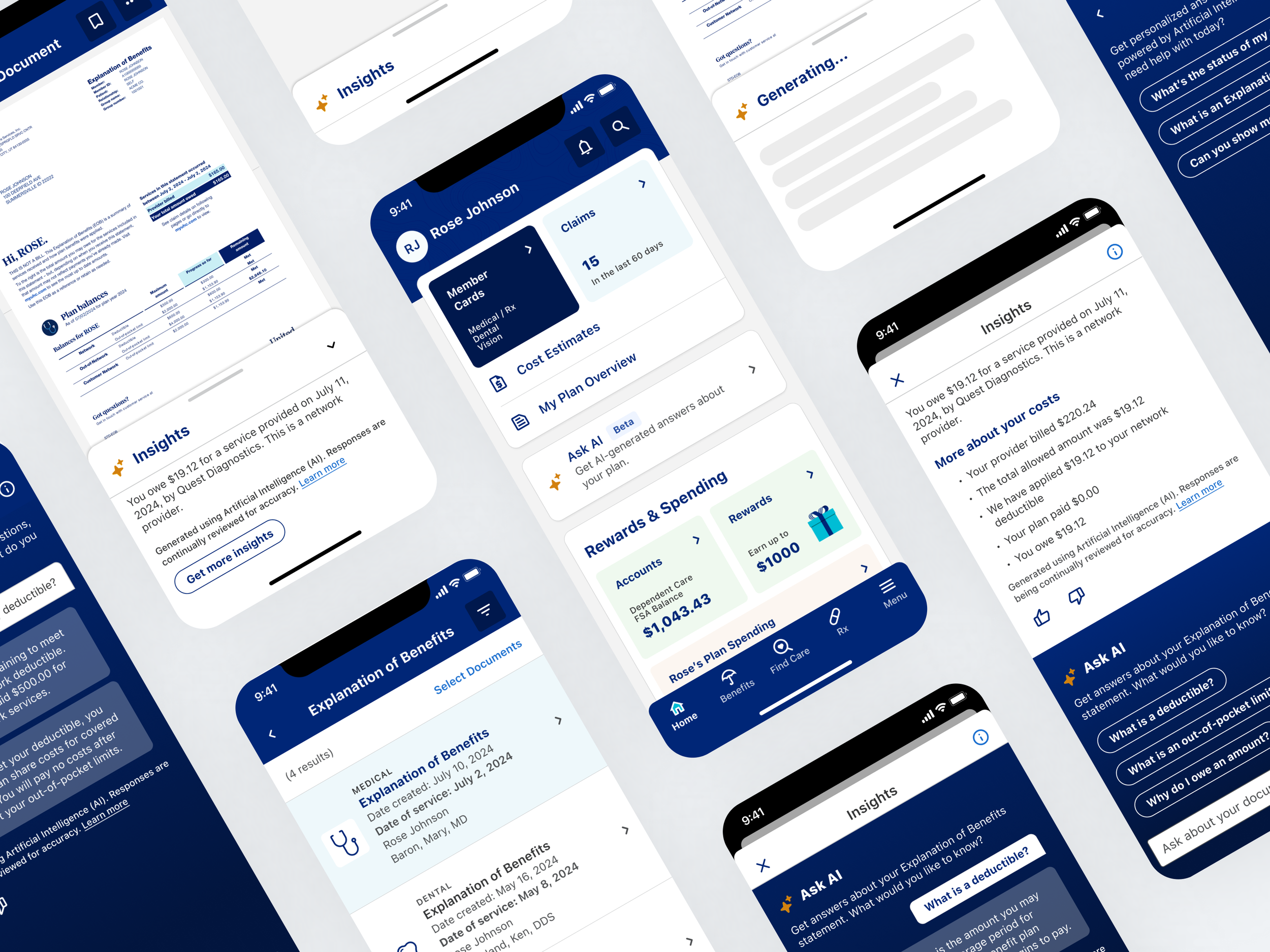
Concept 3: Insights-led experience strategy
This solution provides up-front value for members without them having to do anything extra to get that value. The summary is embedded in the screen, in context of the document it references for optimal usability. And, highlighting cost coverage helps scanability and shows one of the most important member needs up front.
We know from our member needs discovery and jobs-to-be-done analysis that members also need help with next steps if there is anything in their Explanation of Benefits they weren’t expecting or don’t understand. This led us to the creation of the subsequent screen where the member could see expanded insights with more details and an option to Ask AI their question.
This kind of flow follows progressive disclosure usability standards. Some members may get exactly what they need from the smaller summary on the first screen, and some may need additional insights and the opportunity to ask questions.
Phase 4: DESIGN REFINEMENT
I brought many collaborators along with us to make informed decisions and gain support
Timeline: 6 Days
This is the stage where we needed to make decisions and get to one final recommended solution for our MVP beta.
I led the team through the following activities:
Sought feedback and collaborated with our product and engineering partners and other teams in the broader design org including mobile app design, design system, conversation design, claims design, Advocate design, and design strategy
Completed accessibility review
Consulted with engineering on feasibility of design solutions
Developed research objectives and timeline based on the design direction
Presented prototype of the proposed solution for executive review where I earned buy-in and widespread praise
Seeking out diverse feedback and driving alignment
Insight:
It can be difficult to drive alignment with so many stakeholders and conflicting opinions, but it’s important to have the hard conversations sooner rather than later so that there’s true alignment going forward. My job as the leader is to facilitate honest and respectful collaboration to help build trust and creative safety across teams.
Consulted with
10 teams
Collaborated with
20 teammates
Facilitated
22 sessions
Successfully gaining stakeholder alignment
In the most important review and feedback session so far, I presented an organized and detailed view of each concept to our product and engineering partners. During the presentation, I helped our stakeholders understand why design decisions were made, how they aligned with how other digital experiences were handling the same features, and the risks and opportunities of each approach. I was prepared with recommendations on which concept to present to the executive team. Stakeholders were very impressed and excited with the direction which helped build trusting relationships and ease some of their nerves going into the executive review.
HIGHLIGHT:
Stakeholders were very impressed with how clear, organized, and thoughtful my presentation and design recommendation was.
Winning over the executives
Leading a project for innovative design in an extremely condensed timeframe is a feat in itself. Driving complex, large-scale alignment with many different teams is another. Doing them simultaneously? Not for the faint of heart. Top it off with a presentation to the executives to gain ultimate approval and you have yourself an exciting recipe only the most effective leaders can master.
The Chief Product Officer and VPs were very impressed with my presentation and we received the green light.
QUOTE:
“I just saw the demo you shared this AM on the EOB summarization! It looks WICKED good. I love it so much!”
– Senior Vice President, Product
Phase 5: MVP DESIGN FINALIZATION
Getting ready for beta launch
Now that we had a design direction, we needed to finalize all the details to be ready for the beta launch. The team finalized content in partnership with legal and developed design variations for all necessary user states. The project also went through an enterprise review board before it could launch using AI. Beta was successfully released in Q4 of 2024 to 2K members and will be gradually expanded to millions of members.
The team completed the following activities:
Finalized content in partnership with legal
Completed mobile app governance process and made some final design updates
Developed design variations for all necessary user states
Completed member research and considered initial insights in finalization
Project went through an enterprise review board before it could launch using AI
I am never done communicating and always open for more discussion, and after some inspirational conversation with the mobile app team, we decided to update the placement and design pattern of the AI insights section to instead utilize a bottom sheet that was collapsible. This solution was more flexible and better solved for an accessibility accommodation.
I presented our solution in the official mobile app governance process and received full approval.
MY PHILOSOPHY:
Always research – even when there isn’t time
Early on, I worked closely with our researcher to develop testing objectives, a test plan, and research timeline. Because of our condensed project timeline of only 2 weeks to final design, we didn’t have time to get insights before our executive review. However, we still wanted to test the solution so we could continuously improve the designs iteratively.
Research objectives:
Assess usability of the AI elements in the Document Center
Evaluate peoples’ understanding of the AI-generated content
Understand peoples’ perceptions about AI-generated content
Discover peoples’ expectations for AI-generated content
Key research insights and findings:
There is restrained trust with AI and a desire to fact-check it. We saw participants verifying the AI-generated content with what was in the Explanation of Benefits statement. This confirms that the design pattern we chose and placement of the summary was effective since they were able to see the summary in context of their document.
Confidence and trust was higher after seeing this design than it was with generative AI in general. This confirms that the design solutions helped increase trust with participants.
There was compelling support for using AI to generate a summary from their Explanation of Benefits document. This confirms the feature and presentation of the design solution are seen as helpful and valuable. One consumer said: “Wow, that is helpful! I like that it gives me a more detailed version of my insurance activity. I feel like it would make me more appreciative of my insurance company.”
92 - 100% task completion rates for interacting with Ask AI chatbot to ask questions.
Participants confirmed that it didn’t make sense to them to have multiple different coexisting conversational interfaces in the same digital experience, which aligned with my recommendation to product and engineering. (Technical constraint limited this from being addressed during MVP beta).
Expansion to a Global Capability
Because of the promise and initial success with our solution, leadership decided to expand it to a global feature. I worked closely with a new team to implement this broader solution in alignment with our original design. We maintained as much consistency as possible for optimal usability. Because I was so diligent about alignment with many different teams in the original design, we didn’t run into any issues being able to expand this solution into a global app experience.
Within 3 weeks of the Explanation of Benefits beta rollout:
AI insights feature saw 49% engagement rate
Ask AI chatbot saw a 42% engagement rate
BROAD IMPACT:
Because of the promise and initial success of my solution, leadership decided to expand it to a global feature. Because of my diligent approach and leadership during the initial phase, we didn’t run into any issues expanding it